about hou viet pride
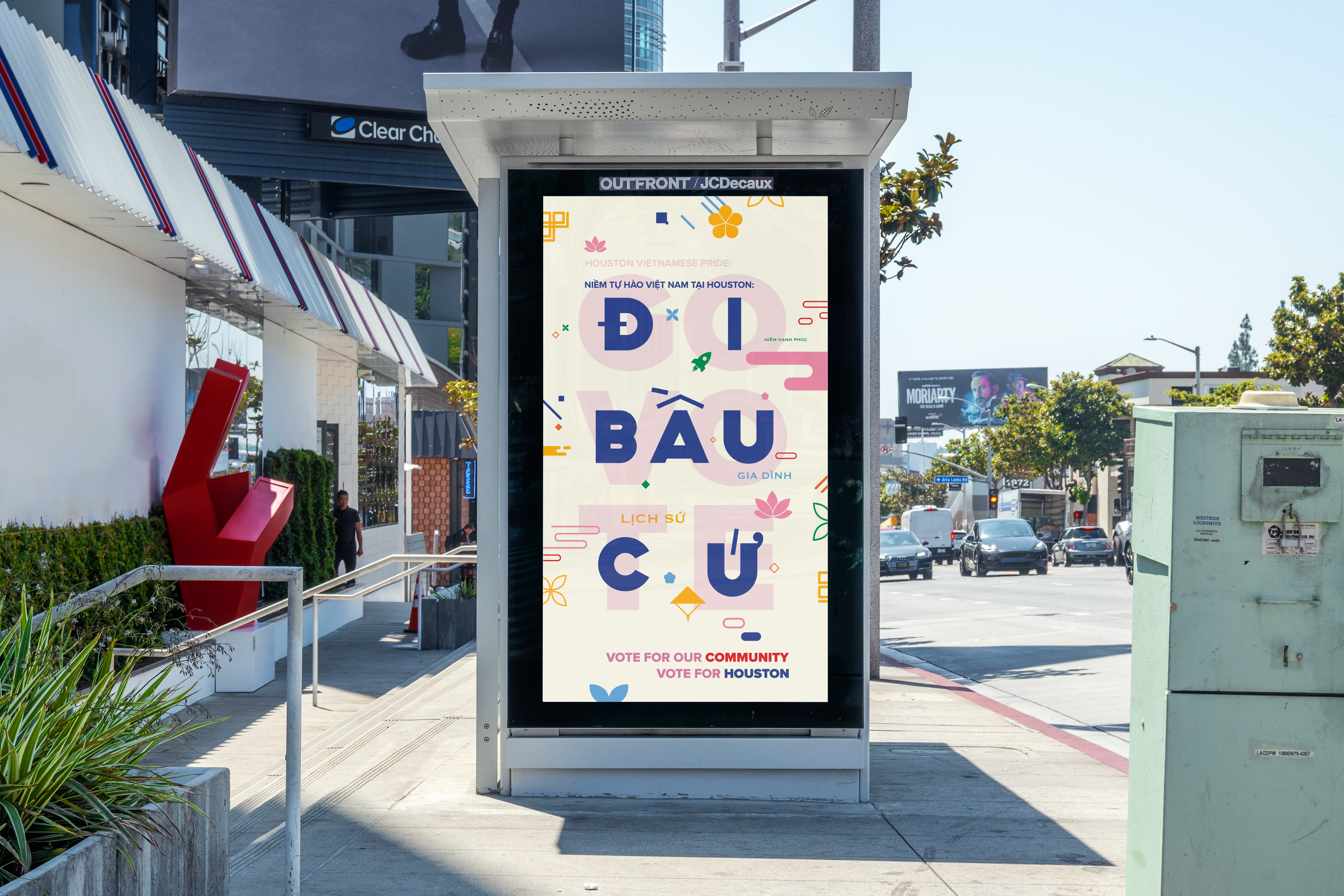
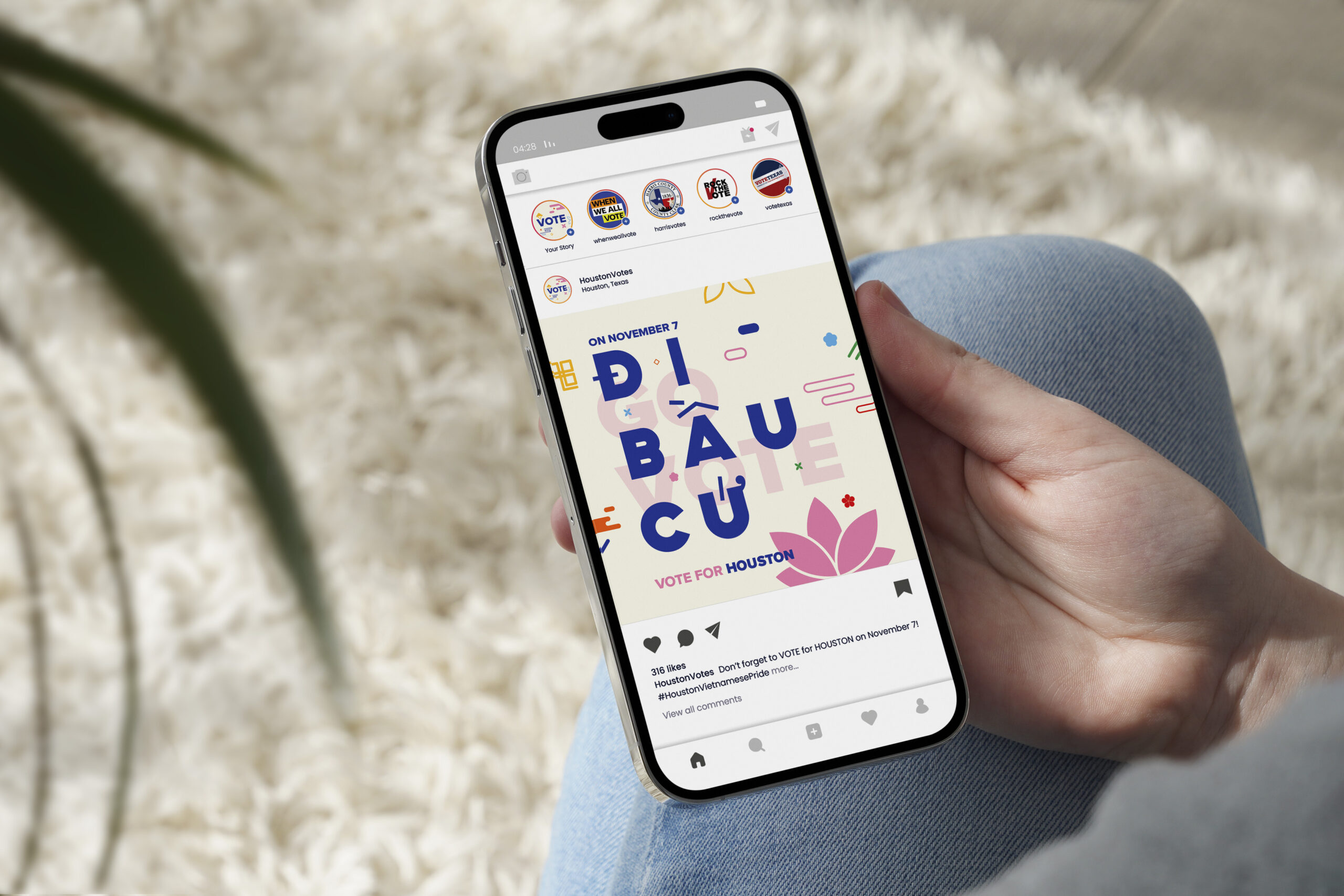
Embracing both Houston and Vietnamese culture in a visual design meant ensuring that the overall identity of HOU Viet Pride would be able to cater to Vietnamese-Houstonians in both the English and Vietnamese languages. As a result, the identity system of the campaign is focused on bold and straightforward typography with accompanying elements. After careful consideration, pursuing iconography alongside the bold typography allowed for each element to be reflective of both Vietnamese and Houstonian culture. These iconographic elements included Vietnam’s national flower: the lotus and Houston’s recognition for space exploration.
The final touches to the ambience of HOU Viet Pride was to encourage a wider color palette: an encouraging, bright, and colorful campaign system. This color scheme not only strayed from the blue and red pairing commonly used in voting campaigns, but embraced a positive and light nature.
- Identity design
- Motion
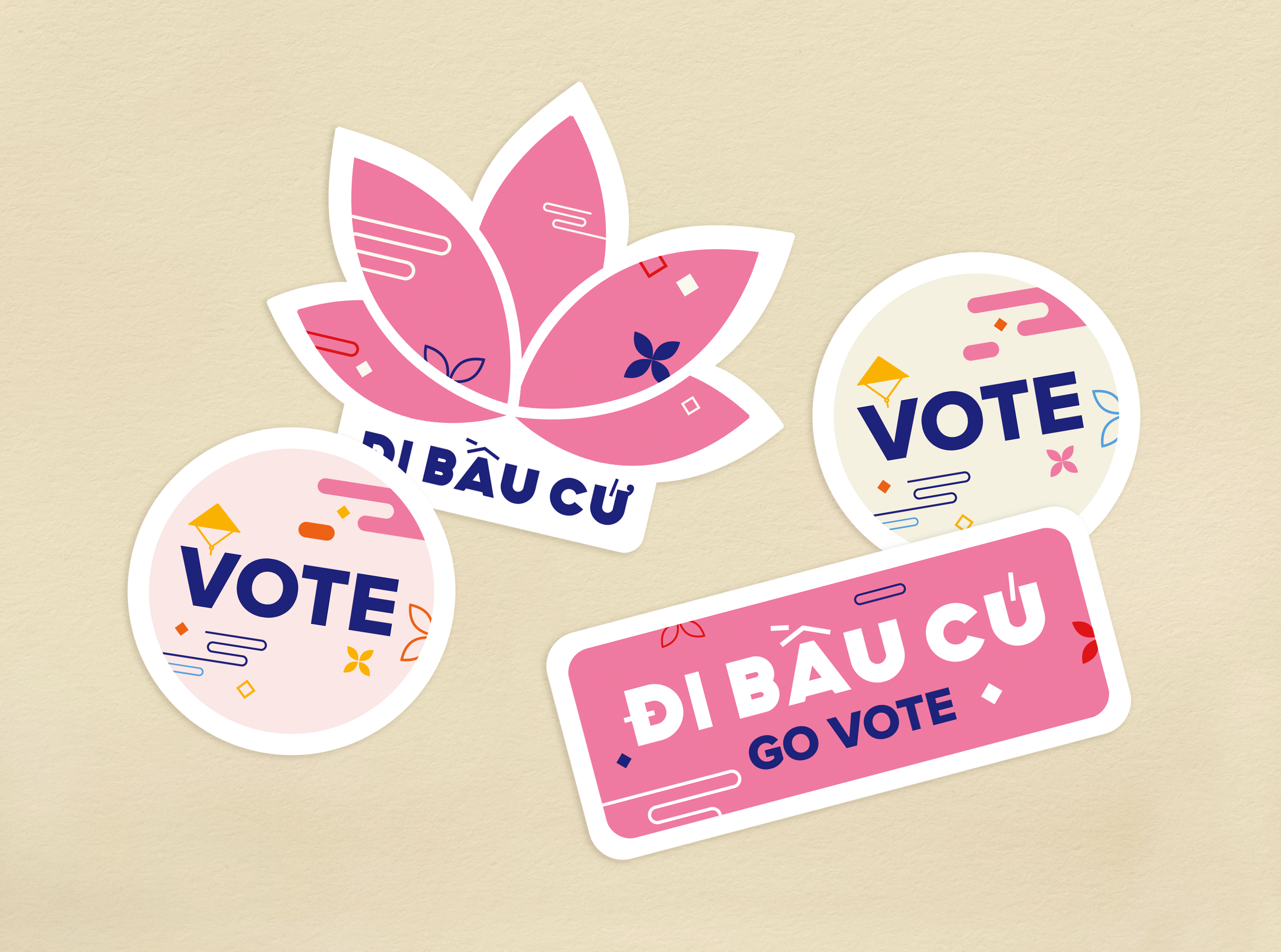
- Stickers
- Fan design


